Forms
You can build a form to collect information from your users.
Important
You may be restricted from collecting certain personal information and other regulated sensitive information via Forms. This may include restrictions set forth in your company’s contract(s) with SailPoint. Consult with your Legal Department before proceeding.
Your company is charged with obtaining consent from data subjects before collecting any additional personal information via Forms.
Should you have any questions, contact your Legal Department.
Forms are composed of sections and fields. Sections split the form into logical groups of fields and fields are the data collection points within the form. Configure conditions to modify elements of the form as the responder provides input. Create form inputs to pass information from a calling feature, like a workflow, to your form.
Forms can be used within workflows as an action or as a trigger. The Form Action allows you to assign a form as a step in a running workflow, suspending the workflow until the form is submitted or times out, and the workflow resumes. The Form Submitted Trigger initiates a workflow when a form is submitted. The trigger can be configured to initiate on submission of a full form, a form element with any value, or a form element with a particular value.
Building a Form
The form builder space allows you to add new sections and fields to create your form. Each form must start with a section and all form fields are nested within a section. Create a section and then add fields for your users to fill out. The field types include date, select, text, text area, and toggle fields.
Note
The maximum form size, including user responses, is 400 kilobytes. If it exceeds this size, the form cannot be saved or submitted.
To build a form:
-
Go to Admin > Global > Forms.
-
Select + New Form.
-
Enter a Name and Description for the new form.
-
(Optional) Select the Add to MySailPoint checkbox if you want this form added to the Forms widget.
-
Select Continue to Builder.
-
Select Add Section to begin building a form.
-
Add fields and configure them so users provide the correct information.
-
Add new sections if necessary.
-
Select Save after you have built your form.
Sections
Sections are used to split long forms into logical groups with similar fields. They can be styled with their own title and description. Any number of fields can be added to a section. A section without any elements can also be used as a title for a form.
To add a section in the form builder:
-
Select Add Section.
-
Enter a name for your section in the Section Header field. The name of the section supports inline variables.
-
Select whether to display the section header in the form using the Display toggle.
-
Choose the header style in the Section Header Text Style field.
-
(Optional) Add a short description that provides additional information about the section for the user in the Section Description field.
-
Select how you want the section header to align in the Section Header Alignment section.
-
After you have configured the section, select Apply.
-
(Optional) Select + Add to add a field to this section.
Fields
Fields are the different data collection points within a form.
Every field requires a label and a technical key. The label is the name displayed for the field element in the form and can use plain text or inline variables. The technical key is the variable that stores the data for this element. When a form is submitted, the data for the form is sent to the workflow through this variable. The technical key is autogenerated from the element label after removing white spaces and special characters, and it is formatted in camel case.
In most cases, the technical key for a field should be unique. However, you can also use fields with the same technical key to ask different users the same question and show each user different sets of selectable answers based on their identity attributes.
For example, if you create an onboarding form asking your users to select their laptop, you might have different options for them based on their department. You can create a Select field for the options available to each department while keeping the same technical key for each laptop selection field. Then, use conditions to show your user only the field for their department.
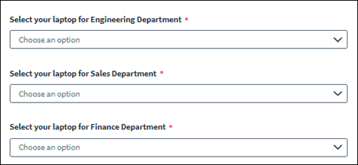
By keeping the same technical key for all these fields, the workflow can consume the laptop selection data from a single variable instead of creating additional conditions.
Column Set
A Column Set allows you to create two columns that hold additional fields.
To add a Column Set to a section, select +Add and choose Column Set. After you have configured the columns, select Apply.
| Field | Description |
|---|---|
| Column Set Header | Enter a name for the columns set. The name of the column header supports inline variables. |
| Display | Select whether to display the header above the column set. Note that if this is enabled, the columns will be displayed to the user even if there are no elements in the columns. |
| Column Set Header Text Style | Choose the header style. |
| Column Set Description | Add a short description that provides additional information about the column set for the responder. |
To add a field to the column set:
-
Select the Add icon
 in the column you want to add to.
 -
Choose the field type and configure your selected field.
-
Select Save to save the form.
Date Field
A Date field allows responders to enter a date.
To add a Date field to a section, select + Add and choose Date Field. After you have configured the field, select Apply.
| Field | Description |
|---|---|
| Label | The label that displays in the form for this field element. This has a maximum of 255 characters and supports inline variables. |
| Technical Key | The variable name to access this field in inputs, conditions, and workflows. |
| Mark as required | Select whether a user is required to fill out this field. |
| Help Text | This text displays under the label and offers guidance to the user. This has no character limit. The default help text is a date format based on the locale of the user's browser. Adding help text will overwrite the date format. |
| Placeholder Text | Example text that displays in the field before user interaction. Note that placeholder text is only for guidance and will not be submitted by the form if the user does not enter a value for that field. |
| Default Date | An actual date value that populates the field before the user has entered text. Default text overrides placeholder text. If the user does not enter a response in the field, the default value will be submitted. Enter a date or select the calendar icon to choose a date. |
Description Field
Use the Description field to add additional context to the form. You can add a footer to your form, describe a set of fields, and add markup to the text using the editor.
To add a Description field to a section, select + Add and choose Description Field. After you have configured the field, select Apply.
| Field | Description |
|---|---|
| Label | The label that displays in the form for this field element. This has a maximum of 255 characters and supports inline variables. |
| Display | Select whether to display the label above the description. |
| Description | Enter the text for the description. Use the editor to apply styles to the text. this field supports inline variables |
To apply styles in the editor, select the ellipses icon  to view additional toolbar items. Select the icon again to hide the toolbar items and return to the text box.
Email Field
An Email field allows responders to enter an email address.
To add an Email field to a section, select + Add and choose Email Field. After you have configured the field, select Apply.
| Field | Description |
|---|---|
| Label | The label that displays in the form for this field element. This has a maximum of 255 characters and supports inline variables. |
| Technical Key | The variable name to access this field in inputs, conditions, and workflows. |
| Mark as required | Select whether a user is required to fill out this field. |
| Help Text | This text displays under the label and offers guidance to the user. This has no character limit. |
| Placeholder Text | Example text that displays in the field before user interaction. Note that placeholder text is only for guidance and will not be submitted by the form if the user does not enter a value for that field. |
| Default Email Address | An actual email address value that populates the field before the user has entered text. Default text overrides placeholder text. If the user does not enter a response in the field, the default value will be submitted. Enter an email address. |
Image Field
Use the Image field to insert an image into the form. You can create a banner for the form by inserting an image at the top of the first form section.
To add an Image field to a section, select + Add and choose Image Field. After you have configured the field, select Apply.
| Field | Description |
|---|---|
| Image Name | The name for the image that can be referenced when the image is used as an effect in conditions. The name of the image supports inline variables. |
| Display | Select whether to display the image name above the image. |
| Image | Choose an image file to upload. Supported file types are .jpg, .jpeg, .png and cannot exceed 2MB. One image can be uploaded per image field and only 10 image fields can be added per form. |
| Alternative Text | This text describes the image for those using screen readers. |
| Image Alignment | Choose the placement of the image in the form by selecting Align left, Align center, or Align right. |
Note
Adding many images to your form can result in delays in rendering the images in the preview and form viewer. The delays will be limited by your network bandwidth.
To use an image as a banner:
-
Create your first form Section.
-
Disable the Display toggle for the Section Header and select Apply to save the new section.
-
Select + Add to add an Image Field to the Section.
-
Disable the Display toggle for the image name and then choose an image file to upload.
-
Select Apply to save.
Phone Field
A Phone field allows responders to enter a phone number that will automatically format according to the country conventions of the entered phone number.
To add a Phone field to a section, select + Add and choose Phone Field. After you have configured the field, select Apply.
| Field | Description |
|---|---|
| Label | The label that displays in the form for this field element. This has a maximum of 255 characters and supports inline variables. |
| Technical Key | The variable name to access this field in inputs, conditions, and workflows. |
| Mark as required | Select whether a user is required to fill out this field. |
| Help Text | This text displays under the label and offers guidance to the user. This has no character limit. |
| Placeholder Text | Example text that displays in the field before user interaction. Note that placeholder text is only for guidance and will not be submitted by the form if the user does not enter a value for that field. |
| Default Phone Number | An actual phone number value that populates the field before the user has entered text. Default text overrides placeholder text. If the user does not enter a response in the field, the default value will be submitted. Enter a phone number. |
Select Field
A Select field creates a pre-populated dropdown list for the responder to select from. Populate the dropdown by using a search query, selecting a predefined list, or entering a list of static options. The user will then use the dropdown to make one or more selections in the form based on the configuration.
There are three types of Select fields that you can build:
-
Static
- Select the Static option to manually add the options you want to display for your user in the select field.
- There is no character limit for the Static Values field.
- Up to 500 unique values can be added to this field.
- The values appear in the order in which they are added.
- You can allow your users to enter their own custom selection in this field.
-
Predefined
- Select the Predefined option and choose a type of object. The user will select from a list of identities, roles, access profiles, sources, entitlements, or machine identities based on your selection.
- This option only allows users to make a selection. There is no option for your user to enter a custom selection.
- This dropdown list displays up to 250 results at a time and can be narrowed down by searching for a value.
-
Basic Search
- Select the Search option to show the results of a search query you enter within the dropdown list displayed to the user.
- Use search filters to customize your searches.
- If the search query returns more than 10,000 items, only the first 10,000 items will be returned.
Caution
If the query you enter returns no results, and this field is marked as required, users might not be able to submit the form.
-
Advanced Search
- Select the Advanced Search option to show detailed results of a search query you enter within the dropdown list, displaying a label and sublabel for results to the user.
- Use search filters to customize your searches.
- If the search query returns more than 10,000 items, only the first 10,000 items will be returned.
Caution
If the query you enter returns no results, and this field is marked as required, users might not be able to submit the form.
-
Form Inputs
- Select a configured array type Form Input. The data returned for that form input is displayed as options in the dropdown list to the user.
- Only array type form inputs are supported here.
- If the Form Input returns more than 100 values, only the first 100 values will be returned.
To add a Select field from the form builder, select + Add and then choose Select Field. After you have configured the field, select Apply.
| Field | Description |
|---|---|
| Label | The label that displays in the form for this field element. This has a maximum of 255 characters and supports inline variables. |
| Technical Key | The variable name to access this field in inputs, conditions, and workflows. |
| Mark as required | Select whether a user is required to fill out this field. |
| Help Text | This text displays under the label and offers guidance to the user. This has no character limit. |
| Placeholder Text | Example text that displays in the field before user interaction. Note that placeholder text is only for guidance and will not be submitted by the form if the user does not enter a value for that field. |
| Require Selection | Enable this toggle to require users to select an option from the pre-populated list. Disable this toggle to allow users to either choose an option from the pre-populated list or to enter their own custom response. This is only available for Static and Search option types. |
| Maximum Selection | Select the maximum number of options a user can select in this field. |
| Option Type | Choose between static, predefined, or search. |
| If you selected Static: | |
| Select Values | Enter custom options to populate a dropdown field in the form. Select + Add to add additional values. Note: If you have a condition set based on a static value and the value gets updated, the condition also needs to be updated to match the new value to continue working. |
| If you selected Predefined: | |
| Predefined Values | Select an object type for which all values will display. |
| If you selected Basic Search: | |
| Category | Select a category to search within to narrow the results. |
| Attribute to Display | Choose which attribute to display in the dropdown list of search results. |
| Search Query | Enter a search query. |
| Add Search Filter | Select to add search filters to narrow your results. |
| If you selected Advanced Search: | |
| Category | Select a category to search within to narrow the results. |
| Label | Select the attribute to display as the primary label in the dropdown list of search results. |
| Sublabel | Select the attribute to display as the secondary value under the label in the dropdown list of search results. |
| Value | Select the attribute to include in internal mapping when the selection is made. This value will not display in the dropdown list of search results. The default selection is ID. |
| Search Query | Enter a search query. |
| Add Search Filter | Select to add search filters to narrow your results. |
| If you selected Form Inputs: | |
| Form Input | Select the form input you want in the form. The values for this input display as options in the dropdown. |
| Sort By | Choose whether to sort A-Z or Z-A. |
Use search filters to narrow your search results. The available filters are:
| Field | Description |
|---|---|
| Includes or Excludes Toggle | Choose whether to include or exclude the selections in the search results. |
| Filter Attribute | Select an attribute to narrow the search results. The available attributes depend on the Category selected. |
| Filter Value | Enter an attribute value to narrow the search results. Inline variables are supported here. |
| Add Search Filter | Select to add another filter. |
Text Field
A Text field allows responders to enter a custom response in a single line.
To add a Text field to a section, select + Add and choose Text Field. After you have configured the field, select Apply.
| Field | Description |
|---|---|
| Label | The label that displays in the form for this field element. This has a maximum of 255 characters and supports inline variables. |
| Technical Key | The variable name to access this field in inputs, conditions, and workflows. |
| Mark as required | Select whether a user is required to fill out this field. |
| Help Text | This text displays under the label and offers guidance to the user. This has no character limit. |
| Placeholder Text | Example text that displays in the field before user interaction. Note that placeholder text is only for guidance and will not be submitted by the form if the user does not enter a value for that field. |
| Default Text | An actual value that populates the field before the user has entered text. Default text overrides placeholder text. If the user does not enter a response in the field, the default value will be submitted. |
Text field validations are criteria the text field entry must meet. Use the Validation tab of the Text Configuration panel to set the criteria, including minimum length, maximum length, and a regular expression to match. If a regular expression is specified, you must also create an error message that is displayed if the field does not meet your requirements.
Note
The default value set for a text field does not check against the text field validations. Setting a default value for a text field that does not match the validations results in an error when a user tries to submit the form with the default data.
Text Area Field
A Text Area field allows users to enter a custom response in a larger text box.
To add a Text Area field to a section, select + Add and choose Text Area Field. After you have configured the field, select Apply.
| Field | Description |
|---|---|
| Label | The label that displays in the form for this field element. This has a maximum of 255 characters and supports inline variables. |
| Technical Key | The variable name to access this field in inputs, conditions, and workflows. |
| Mark as required | Select whether a user is required to fill out this field. |
| Help Text | This text displays under the label and offers guidance to the user. This has no character limit. |
| Placeholder Text | Example text that displays in the field before user interaction. Note that placeholder text is only for guidance and will not be submitted by the form if the user does not enter a value for that field. |
| Default Text | An actual value that populates the field before the user has entered text. Default text overrides placeholder text. If the user does not enter a response in the field, the default value will be submitted. |
| Resize | Enable this toggle to allow the responder to resize the text area box as needed. This is only for visual purposes. There is no data limit in this field. |
| Rows | Select the number of rows for the default size of the text area element. The maximum number of rows you can select is 20, but there is not a row limit to how much data can be entered. If the data exceeds the chosen number of lines, a scroll bar will appear. |
Toggle Field
A toggle field captures true or false responses in the form. The toggle itself is customizable. You can set the default state of the toggle as well as create custom labels for both the true and false states.
To add a Toggle field to a section, select + Add and choose Toggle Field. After you have configured the field, select Apply.
| Field | Description |
|---|---|
| Label | The label that displays in the form for this field element. This has a maximum of 255 characters and supports inline variables. |
| Technical Key | The variable name to access this field in inputs, conditions, and workflows. |
| Help Text | This text displays under the label and offers guidance to the user. This has no character limit. |
| Default State | Choose whether the toggle displays as true or false before user interaction. |
| True Label | Choose a label to display when the toggle is set to true. |
| False Label | Choose a label to display when the toggle is set to false. |
Settings
On the Settings page, you can edit the form details, add inputs, and create conditions for the form. From the form builder, select the Settings icon  . Form inputs and conditions work together to pass data from a workflow into a form.
Details
From the Details page, you can edit the name and description of the form.
-
Go to Settings > Details.
-
Make any changes to the name and description.
-
(Optional) Select the Add to MySailPoint checkbox if you want the form added to the Forms widget.
-
Select Apply to apply your changes.
-
Select the Exit icon
 to exit the Settings page.
 -
Select Save to save your changes.
Form Inputs
Form inputs are used when you want to send data from a workflow to a form, using the Form Action step in a workflow. These inputs use dynamic data from the workflow to pre-populate the form and determine which conditional form elements to display to the user completing the form. From the Form Inputs page, you can create variables with unique names. These inputs are used to build conditions in your form. Data is then passed from a workflow into the form using these variables and conditions.
Form inputs are also used as inline variables in the form. Inline variables are supported in all field, section, and column labels. This allows you to create customized labels as data is pulled into the form.
Caution
Inputs should be uniquely named. An ID is auto-generated for the Input based on the assigned name. The name can be changed later, but that automatically updates the ID. Any changes to the ID will break existing conditions or inline variables. Conditions and inline variables using that Input will need to be updated with the new ID.
To create a form input:
-
Go to Settings > Form Inputs.
-
Select + New Input.
-
Enter a unique name for the variable. The name must be at least 3 characters long.
The ID is auto-generated based on the name.
-
Select the input type.
-
(Optional) Enter a description for the variable.
Repeat steps 2-5 until you have created all necessary inputs, up to a maximum of 20 inputs.
-
Select Apply.
-
Select the Exit icon
to exit the Settings page. -
Select Save to save your changes.
You must create conditions using these inputs for the data to get passed from the workflow into the form.
You must add a JSONPath expression to the desired label to use inline variables in the form.
Conditions
Conditions allow you to change the fields that are shown to users based on how the user answers previous questions in the form or based on the data passed into the form from a workflow. Conditions consist of rules and effects.
A rule uses a comparison operator to compare a selected technical key or form input to a value and evaluates it as true or false. You can create multiple rules in a condition. Rules will be applied in the order they appear. An effect is a state that a form element takes if the conditions of the rule are met. You can add multiple effects for the same condition, applying the effects to the same or multiple form elements. Effects will apply in the order they appear.
Note
-
If you have multiple effects set for the same form element that contradict each other, the last listed effect will remain.
-
If a condition rule is not met, the contrary effect will be applied.
-
A maximum of 20 rules can be added to the same condition.
-
A maximum of 20 effects can be added to the same condition.
To create conditions for your form:
-
Go to Settings > Conditions.
-
Select + Create New.
-
Configure the criteria that must be met for this condition. This is the rule of the condition.
-
To add additional rules to the same condition, select + Add and configure the additional fields.
-
Select Any or All on the toggle to indicate when the effects apply.
-
Configure how the form elements will be impacted when the criteria for this condition are met. This is the effect of the condition.
-
To add additional effects to the same rule, select + Add and configure the additional fields.
-
After you have configured your condition, select Apply.
-
Select the Exit icon
to exit the Settings page. -
Select Save to save your changes.
| Field | Description |
|---|---|
| If | Select a technical key or form input to compare with another value within the rule. |
| Comparison Operator | Select a comparison operator that compares the selected technical key or form input to the string value. |
| String Value | Enter a value to compare to the technical key or form input in the If field. |
| A List of Values | Enter one or more values to compare to the selected form input values or Select field values in the If field. This option is only available if the selected input is an array type input. |
| Any or All | Choose whether Any or All of your rules must be met for the effects to apply. Select Any to apply the effects if one rule is met. Select All to require all rules to be met for the effects to apply. |
| Action | Select an action to apply to the selected element if the rule or rules are met based on your configurations. |
| Element | Select a form element for the action to apply to. |
The comparison operators compare the form element with the selected technical key or form input to the string value. The available comparison operators are:
| Operator | Description |
|---|---|
| Equals | The form element value is equal to the entered string value. |
| Does Not Equal | The form element value is not equal to the entered string value. |
| Contains | The form element value contains the entered string value. |
| Does Not Contain | The form element value does not contain the entered string value. |
| Is Empty | The form element value is empty. If this operator is selected, the String Value field becomes disabled. |
| Is Not Empty | The form element has a value. If this operator is selected, the String Value field becomes disabled. |
| Ends With | The form element value ends with the entered string value. |
| Does Not End With | The form element value does not end with the entered string value. |
| Includes | The form element value includes the entered string value. This operator only applies to form elements with multiple selections allowed. |
| Does Not Include | The form element value does not include the entered string value. This operator only applies to form elements with multiple selections allowed. |
| Starts With | The form element value starts with the entered string value. |
| Does Not Start With | The form element value does not start with the entered string value. |
The actions are how the selected field element will be changed when the criteria of the condition are met. The available actions for the effect are:
| Action | Description |
|---|---|
| Hide | Hides the selected form element. |
| Show | Shows the selected form element. |
| Enable | Enables the selected form element to allow user input. |
| Disable | Disables the selected form element. Users can see the form element but cannot interact with it. |
| Set Default Value | Sets a default value for the form element from a selected form input. Use the From dropdown to select the form input you want to use for the default value. Note that users are still able to change this value. If you want to set a default value that cannot be changed, add another effect. Set the Action to Disable and select the same form element. This will set the default value and make the element read-only. Note: The Select field elements do not support setting a default value. |
To create conditions using defined form inputs:
-
Go to Settings > Conditions.
-
Select + Create New.
-
In the If field, select the form input you want.
-
Set the Comparison Operator to Is Not Empty.
-
Select All on the toggle to indicate when the effects apply.
-
Set the Action to Set Default Value.
-
In the From field, select the form input you want to be the default value.
-
In the Element field, select the form element to apply the default value to.
The Select field elements do not support setting a default value.
-
(Optional) To make the default value read-only:
a. Select + Add to add another effect.
b. Set the Action field to Disable.
c. In the Element field, select the same form element.
-
After you have configured the condition, select Apply.
-
Select the Exit icon
to exit the Settings page. -
Select Save to save your changes.
Inline Variables
Inline variables use form inputs and form data to create customized data and descriptions in the form. Inline variables are supported in all field, section, and column labels. Multiple inline variables can be used within one label. Include a complete JSONPath expression in a label to add an inline variable to your form.
If there is an error evaluating an inline variable, it will present as a blank space.
Note
The text {{$.}} can no longer be used as plain text in a label. This is evaluated as an incomplete inline variable and results in an error.
To use an inline variable from a form input, enter:
{{$.form.input.[inputID]}}
For example:
{{$.form.input.studentName}}
This expression uses the name of the form input as text in the label of a field.
To use an inline variable from form data, enter:
{{$.form.data.[technical key of the form element]}}
For example:
{{$.form.data.country}}
This expression uses the data from that form element as text in the label of a field.
Note
If you use a Date field technical key as a form data inline variable for a label, the data displays using your local date format.
To use multiple inline variables together, enter both JSONPath expressions in the label. No operations are supported, but each expression is evaluated individually.
For example:
(attributes.country:{{$.form.data.country}} AND attributes.department:{{$.form.data.department}})
As a label, this expression uses the form data to display the country and department entered into the form fields.
Inline variables referencing the Select Field in a label or in a Description field can choose to reference the ID, label, or sublabel of the selection made in the form.
To reference the ID, enter:
{{$.form.data.selectField}}
To reference the label, enter:
{{$.form.data.selectField.label}}
To reference the sublabel, enter:
{{$.form.data.selectField.subLabel}}
Interactive Forms
Interactive Forms are used within a workflow to collect user input during the flow of the interactive process. Adding an Interactive Form action to a workflow allows you to insert an interactive form into a workflow. When the workflow gets to the Interactive Form step, it will pause and wait for the user to enter the required information before proceeding, using the information collected from the user to perform the steps that follow in the workflow. For more information on adding an interactive form to a workflow, refer to the Interactive Process documentation.
Important
Interactive Form actions can only be added to workflows using the Interactive Trigger. Adding an Interactive Form action to a workflow without the Interactive Trigger results in validation errors and the workflow cannot be enabled.
Interactive Forms are also used within Privilege Task Automation workflows built from templates. When a Privilege Task Automation template is selected, the forms within the template are automatically created and configured within the Interactive Form actions.
Caution
Forms that are automatically created within templates have been designed to collect specific information for the required actions in the workflow. Editing these forms could impact the success of the workflow.
If you delete a workflow that had a form attached to an Interactive Form action, the form is not deleted. To delete the form, after deleting the workflow, you must separately delete the form.
Canceling an Interactive Form
Interactive Forms are canceled by an admin or when a user fails to submit the form within 30 days. If error handling is not enabled for the Interactive Form action, the workflow will be canceled if the interactive form is canceled. If the Interactive Form action has error handling enabled and a form is canceled, the action encounters an error and the workflow proceeds down the error branch of the workflow.
Managing a Form
The Forms page is a centralized location to manage your organization’s forms. You can view details, edit, delete, and duplicate a form. You can also view the workflow or list of workflows currently using the form.
Editing a Form
To view and edit the details of a form, select the name of a form.
On the Details tab, you can view and edit the name, description, and owner, as well as add the form to the Forms widget on the MySailPoint home page. You can also view when the form was created and last modified. Select Save to keep any changes you make.
On the Used By tab, you can view which workflows are currently using the form and if the form is shown in the Forms widget on the home page. You can also select the links to go directly to Workflows list page or the Forms widget.
Select Edit in Builder to edit the form.
Select the Delete Form icon  to delete the form. Select Delete on the confirmation message to confirm that you want to permanently delete the form. You cannot delete a form that is used in a workflow.
If you did not make changes, select the Close icon  to close the panel.
To edit a form, select the Actions icon  and select Edit in Builder.
In the form builder, you can edit, move, duplicate, or delete sections or fields.
To edit a field or section:
-
Select the Edit icon
 on a field or section you want to edit.
 -
Make any configuration changes and select Apply to apply your changes.
-
Select Save to save the form.
To move a field or section:
Fields and sections can be moved in the form builder by using the arrow icons or dragging and dropping them to the new location.
-
Select the Move Up icon
 to move a field or section one space up in the form.
 -
Select the Move Down icon
 to move a field or section down one space.
The fields can be moved up or down within their current section or to other sections one space at a time using the arrows.
To drag and drop a field or section, select the entry you want to move and drag it to the new placement. Fields can be moved within a section or to a different section. Sections can be moved into a different order.
To duplicate a field or section:
-
Select the Duplicate icon
 to create a copy of a field or section.
This opens the configuration panel for the new field or section.
-
Make the configurations you want.
-
Select Apply to save your changes and create the new field.
To delete a field or section:
-
Select the Delete icon
to delete a field or section.Caution
This will immediately delete the field or section without confirming first.
To edit the Submit button:
You can edit the label and location of the Submit button on a form.
-
Hover over the Submit button and select the Edit icon
. This opens the configuration panel for the Submit button.
-
Enter a new label for the button.
The maximum length for the label is 50 characters.
-
Select Left, Center, or Right to choose the alignment for the button.
-
Select Apply to save your changes.
Duplicating a Form
From the form manager, you can duplicate a form.
-
Select the Actions icon
and then select Duplicate Form.The form is duplicated and added to the top of the form table with “Copy of” before the name of the duplicated form.
-
Select the name of the duplicate form to edit its name and description.
-
Select Edit in Builder to continue editing the new form or Save to save the new details and return to the form manager.
Deleting a Form
From the form manager, you can delete a form.
-
Select the Actions icon
and then select Delete Form. -
Select Delete to confirm deletion of the form.
Previewing a Form
Preview a form to ensure the form is functioning as expected. You can add values for inputs to test the form using different data sets.
Select Preview from the form builder. You can view the form as a user will receive it. Interact with any fields you would like to test.
To test the form using inputs:
-
Select the Show icon
 to show the input fields.
 -
Add inputs and values to test the form with different data sets.
- For a string type input, type a value into the value field.
- For an array type input, type a value into the value field and select Enter. Repeat this for all values you want to test.
-
Select Test Validations to test the validations of the form.
When you are done previewing the form, select the Close icon  or the Back icon
  to go back to the form builder.
Changing a Form Owner
When you create a form, you are assigned as the default owner of the form. An admin can change the form owner after the form is created.
To change a form owner:
-
Select the form name in the Forms table.
-
On the Details tab, select the Owner dropdown.
-
Select a name from the list of Admins in the dropdown.
-
Select Save to save the new form owner.
Using the Forms Widget
The Forms widget allows admins to create, view, edit, and manually launch forms from the home page.
From the Forms widget, select Create New to create a new form.
To view a form, select the Preview icon  .
.
To edit a form, select the Edit icon  .
.
To launch a form, select the Launch icon  .
.
Select up to 10 forms to add to your Forms widget for quick access.
To add a form:
-
Select the form name in the Forms table.
-
On the Details tab, select the Add to MySailPoint checkbox.
-
Select Save.
The form is added as a quick link to the Forms widget on the home page.
Note
If you save after you select the checkbox and 10 forms are already added to the widget, an error message displays and the changes will not save.
Completing a Form
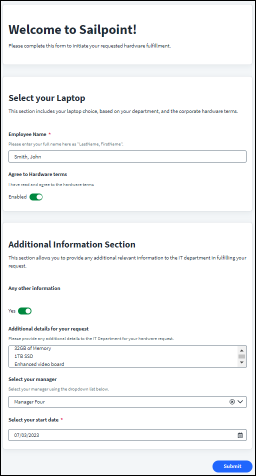
When you assign a form to a user, they receive an email notification with a link to the form. This link is their only access to this form. When they follow the link, they are prompted to log in to Identity Security Cloud and then brought directly to the form. Ensure the form is thoroughly defined so it tells your responder everything they need to know to fill out the form correctly. A responder cannot save and return to the form. They can leave and use the same link to get to the form again, but they will need to start over. If they have not filled out the form, a reminder email is sent to them. After the configured deadline has passed, the form is no longer available for submission.
Here is an example of what your form might look like to your users:
Documentation Feedback
Feedback is provided as an informational resource only and does not form part of SailPoint’s official product documentation. SailPoint does not warrant or make any guarantees about the feedback (including without limitation as to its accuracy, relevance, or reliability). All feedback is subject to the terms set forth at https://developer.sailpoint.com/discuss/tos.