Visualizing Data with Data Explore
Data Explore helps you track and visualize data about your governance environment over time.
Note
Data Explore is not available for FedRAMP users.
About Data Explore
Making data-informed decisions is crucial to running an effective and innovative identity governance program. Data Explore puts all of your organization's identity data at your fingertips, making it easy to:
-
Monitor new governance-focused metrics across your organization
-
Generate and share interesting insights and knowledge with leadership
-
Present historical data for post-event analysis and reporting
To access Data Explore, select Admin > Dashboard > Data Explore in the SailPoint interface. Use Data Explore's top navigation to access the following:
-
Sources - A list of tables representing the columns of data being tracked, and parameters available for querying
-
Charts - A space to create queries and generate visualizations based on the query results
-
Dashboards - A set of visualizations, including prebuilt and custom combinations of charts
Note
The source account totals displayed in Data Explore are filtered. The source account totals in Data Explore reflect only accounts that match authoritative identities not in an error state (that is, the required identity attributes of last name, email, and UID have all been populated).
Best Practice
To follow the principle of least privilege, grant report admin user-level permissions to employees that you want to have view access to the Access History and Data Explore interfaces. For more information, refer to Report Admin User Level.
Exploring Data in Tables
The tables available in Data Explore represent your SailPoint Identity Platform data source. Tables are defined and maintained by SailPoint.
To explore your tables and determine how they affect what can be displayed in visualizations:
-
In Data Explore, select Sources > Tables to display the list of tables available for your data source.
-
Select the magnifying glass icon
 next to a table name to display additional information on the Show Table page.
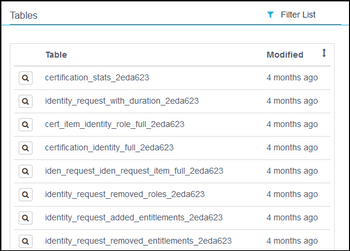
-
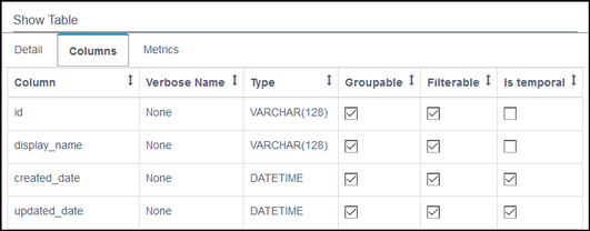
Use the tabs on the Show Table page to determine how your data is exposed and define the fields available in the Charts interface.
-
Detail - Provides detailed information about the table.
-
Columns - Lists table columns and provides selectable parameters that define the fields displayed in the Charts page.
For example, if the Filterable and Is temporal parameters are both checked for a column, it will be available for filtering when choosing a query time period in the Charts interface. Refer to Creating Charts for more information.
-
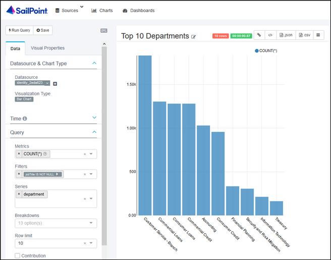
Metrics - Displays the metrics available to you when querying the table. Metrics define the value axis for a visualization, so you can determine what type of data to expect in a visualization.
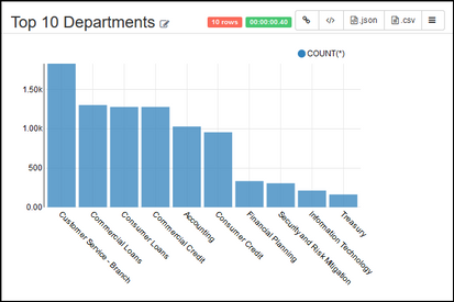
For example, the following images show the
COUNT(*)metric and how it is expressed in the Top 10 Departments chart. BecauseCOUNT(*)is the only metric available, you can only view departments by number count. If multiple metrics exist for a table, you can sort by multiple metrics in your chart. You cannot add or remove metrics.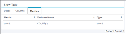
-
Creating Charts
Charts are generated from the results of a query, so you'll need to start by creating a query based on the subset or "slice" of data you're interested in.
Your query becomes a chart only after you build a visualization and save it. A chart is a saved query paired with a visualization.
To create a query and generate a visualization for it:
-
Select Sources > Tables to display the tables available for querying. Refer to Exploring Data in Tables for more information.
-
Navigate to the query page. You can start a query in a couple ways:
-
Go to Sources > Tables, and select a table entry in the list.
-
Go to Charts, and select the Add Record icon
 to add a new chart. Select a Datasource (table) and Visualization Type, and select Create new chart.
Both ways bring you to the same query / visualization page you use to create charts.
a. On the Data tab, adjust the Visualization Type and Query options. The available query options depend on the type of visualization you choose.
b. On the Visual Properties tab, adjust visualization properties like color and timestamp format.
c. To better understand the data that will be returned for your selections, select the Menu icon
 in the top right to list the query, results, and samples.
d. Select Run Query to refresh the visualization after you change the type and query options.
-
-
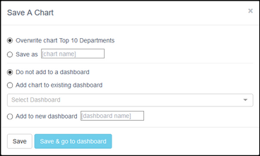
When you have finished creating the visualization, select Save to enter a chart name and optionally add the chart to a dashboard.
If you don't add the chart to a dashboard at this time, it will be available on the Charts page (along with any other charts you have saved), for ad hoc analysis or to be included in a dashboard later. Refer to Displaying Charts in Dashboards for more information.
Working with Charts
Select Charts to access the Charts page which displays a list of all the charts you have saved.
Here, you can work with charts as follows:
- Filter the chart list
- Select a chart name to go to the query / visualization page
- Inspect and edit chart details
- Delete charts
Displaying Charts in Dashboards
You can create dashboards that include multiple charts to provide a more complete and personalized view of your data. The information in each chart automatically refreshes every time you access a dashboard that includes that chart.
To display a list of existing dashboards, select Dashboards in Data Explore.
A dashboard can only be edited by its creator, but you can save a copy of any dashboard with a different name and then make changes to the new dashboard.
Exploring Prebuilt Dashboards
Data Explore comes with prebuilt dashboards to provide you with a clear and comprehensive view of key governance data across your organization.
Your organization's configuration determines the data available for display and the available filters, so data might not be displayed in all of the charts in a prebuilt dashboard.
To explore prebuilt dashboards, select Dashboards, then select either Employee Dashboard, Request Statistics, or Certification Statistics.
You can select the More icon  on any chart in a dashboard to dive deeper into the individual chart's query and adjust the chart settings. Refer to Creating Charts for more information.
Employee Dashboard
The Employee dashboard provides a snapshot of your core identity data and allows you to dynamically filter by identity attributes.
For example, filter by Finance for department and San Francisco for location to display how many new identities have been added in the last quarter to the San Francisco office's Finance department or display the top roles held by identities in that department and location.
This dashboard includes the following charts:
- Number of identities
- New identities by quarter
- Accounts by source
- Employees by department by location
- Employees by location by title
- Employees by state
- Top job titles
- Top roles
- Top access profiles
- Top entitlements
Request Statistics Dashboard
The Request Statistics dashboard provides a number of views into your request activity, such as application, entitlement, and role requests by popularity, location, and department.
For example, you can display your organization's most-requested applications to inform IT investment decisions or help determine which apps new hires will likely need to access.
This dashboard includes the following charts:
- Number of requests by department - 1 yr
- Number of requests by location - 1 yr
- Average request time by location
- Most requested entitlements
- Most requested roles
- Most requested applications
- Approved vs rejected by app
Certification Statistics Dashboard
The Certification Statistics dashboard uncovers data about your certifiers and certification activity, helping you improve and ensure adherence to governance policies. You can filter by certifier location, department, and job title to further focus your exploration.
For example, filter by the Accounting department to display your top certifiers' activity in that department, possible issues with certification timelines, and Accounting-wide certification activity.
- The Certification Statistics dashboard includes the following charts:
- Most revoked entitlements
- The number of decisions by department
- Top certifiers with analytics around their approval activity
- Late certifiers and their number of days late
Creating a New Dashboard
You can create your own dashboards to supplement the prebuilt dashboards that SailPoint provides.
You need at least one chart to create a dashboard. If you have not created any charts, do that first, or use existing charts from the list on the Charts page.
There are two ways to create a new dashboard: on the Dashboards page or when saving a new chart.
On the Dashboard page:
-
Select Dashboards, and then select the Add Record icon
to add a new dashboard. -
Provide the following information for your dashboard: a title, the charts to include, the owner, and any JSON and CSS to use to customize the dashboard.
-
Select Save to create the dashboard.
When saving a new chart:
-
When saving a new chart, select Add to new dashboard and enter a name for the dashboard.
-
Select Save & go to dashboard. Your new chart appears in your new dashboard.
Your new chart and dashboard also appear in the lists on the Charts page and Dashboards page, respectively.
Sharing and Exporting Data, Visualizations, and Dashboards
You can easily export and share your data, visualizations, or dashboards with others.
Exporting Data
Table and chart data on the query / visualization page can be exported as a CSV or JSON file.
-
Select the Export .json icon
 to export the
 .jsonfile and save or copy the data. -
Select the Export .csv icon
 to save data as a
 .csvfile.
Sharing Visualizations
On the query / visualization page, select the Link icon  to copy the URL associated with the visualization and share it with other authenticated users.
Sharing Dashboards
On a Dashboard page, select Edit dashboard > Share dashboard to copy the URL associated with the dashboard and share it with other authenticated users.
Documentation Feedback
Feedback is provided as an informational resource only and does not form part of SailPoint’s official product documentation. SailPoint does not warrant or make any guarantees about the feedback (including without limitation as to its accuracy, relevance, or reliability). All feedback is subject to the terms set forth at https://developer.sailpoint.com/discuss/tos.