Set Up a New UI Source Configuration
Create a new UI source configuration in the elements such as fields, sections, and more.
The following topics are covered in this section:
Understanding an Example of a UI Source-Config
The following is an example of the ServiceNow UI source-config:
<?xml version="1.0" encoding="UTF-8"?>
<!-- Copyright (C) 2021 SailPoint Technologies, Inc.  All rights reserved. -->
<Form xmlns="http://www.sailpoint.com/xsd/sailpoint_form_2_0.xsd" name="ServiceNow" connectorName="ServiceNow-Direct" type="SourceConfig" directConnect="true" shortDesc="Description of connector" status="released">
<BaseConfig>
        <Field name="fileUpload" maxFiles="15" supportedExtensions="jar"
            type="fileupload" maxSize="300" validateJSON="false" />
  </BaseConfig>
  <Menu name="ConnectionSettings" label="menuLabel_ConnectionSettings">
    <Section name="authtype" label="menuLabel_ConnectionSettings" sectionInfo="SectionInfo_AuthenticationType">
      <Field name="url" displayName="url" type="url" required="true" />
      <Field name="authtype" displayName="authtype" type="radio" defaultValue="Basic">
        <AllowedValues>
          <Option label="Basic" value="Basic" />
          <Option label="OAuth 2.0" value="OAuth2" />
        </AllowedValues>
      </Field>
      <!-- Fields for 'Basic' authentication -->
      <Field name="username" displayName="username" type="text" required="true" parentKey="authtype" parentValue="Basic" />
      <Field name="password" displayName="password" type="secret" required="true" parentKey="authtype" parentValue="Basic" />
      <!-- Fields for 'OAuth 2.0' authentication -->
      <Field name="clientId" displayName="clientId" type="text" required="true" parentKey="authtype" parentValue="OAuth2" />
      <Field name="clientSecret" displayName="clientSecret" type="secret" required="true" parentKey="authtype" parentValue="OAuth2" />
      <Field name="refreshToken" displayName="refreshToken" type="secret" required="true" parentKey="authtype" parentValue="OAuth2" />
    </Section>
  </Menu>
  <Menu name="AggregationSettings" label="menuLabel_AggregationSettings">
    <Section name="AdditionalSettings" label="sectionLabel_FilterSettings" sectionInfo="SectionInfo_AggregationSettings" >
      <Field name="deltaAggregationEnabled" displayName="deltaAggregationEnabled" type="checkbox" defaultValue="true" />
      <Field name="ManageRolesforGroup" displayName="ManageRolesforGroup" type="checkbox" defaultValue="true" />
      <Field name="manageInheritedRole" displayName="manageInheritedRole" type="checkbox" defaultValue="false" />
      <Field name="accountFilterAttribute" displayName="accountFilterString" type="text" required="false" />
      <Field name="groupFilterAttribute" displayName="groupFilterString" type="text" maxlength="999" />
      <Field name="roleFilterAttribute" displayName="roleFilterString" type="text" maxlength="999" />
      <Field name="pageSize" displayName="pageSize" type="number" defaultValue="1000" min="1" max="10000" />
    </Section>
  </Menu>
  <Menu name="AdvancedSettings" label="menuLabel_advancedSettings">
    <Section name="Timeout Settings" label="sectionLabel_TimeoutSettings" sectionInfo="SectionInfo_TimeoutSettings" >
      <Field name="aggregateTimeout" displayName="aggregateTimeout" type="number" helpKey="helpKey_seconds" min="180" max="7200" defaultValue="3600" />
      <Field name="provisioningTimeout" displayName="provisioningTimeout" type="number" helpKey="helpKey_seconds" min="30" max="600" defaultValue="60" />
    </Section>
    <Section name="UnlockOnEnableAccount" label="sectionLabel_unlockOnEnableAccount" sectionInfo="SectionInfo_UnlockOnEnableAccount" >
      <Field name="unlockOnEnableAccount" displayName="unlockOnEnableAccount" type="checkbox" defaultValue="false" />
    </Section>
    <Section name="Use Sys ID Reference" label="sectionLabel_UseSysIdReference" sectionInfo="SectionInfo_UseSysIdReference" >
      <Field name="useSysIdReference" displayName="useSysIdReference" type="list" />
    </Section>
    <Section name="Retry Errors Settings" label="sectionLabel_RetryErrorsSettings" sectionInfo="SectionInfo_RetryErrorsSettings" >
      <Field name="retryableErrors" displayName="retryableErrors" type="list" />
      <Field name="retryCount" displayName="retryCount" type="number" defaultValue="1" min="1" max="5" />
    </Section>
    <Section name="Request Param Settings" label="sectionLabel_RequestParamSettings" sectionInfo="SectionInfo_RequestParamSettings" >
      <Field name="requestParamMap" displayName="requestParamMap" type="keyValue" readOnly="false">
        <Key name="Key" type="text" required="false" readOnly="false" placeHolder="key" />
        <Value name="Value" type="text" required="false" readOnly="false" placeHolder="value" />
      </Field>
    </Section>
  </Menu>
</Form>
The following screenshot is the how the example is represented in the UI:
 Screenshot
Note
The above UI representation of the Base Configuration Menu page is for reference only. You do not need to provide configuration details of Base Configuration in the source-config. For more information refer to the note under The Menu Element section.
The Form Element
The Form element is the root XML element that contains multiple Menu elements within it. It provides source config attribute information such as the XML namespace, connector type, status, etc.
For example:
<?xml version="1.0" encoding="UTF-8"?>
<Form xmlns="http://www.sailpoint.com/xsd/sailpoint_form_2_0.xsd" name="ServiceNow" connectorName="ServiceNow-Direct" type="SourceConfig" directConnect="true" shortDesc="Description_of_connector" status="released">
Note
Be sure to use sailpoint_form_2_0.xsd to validate the structure and grammar of the source config.
For example:
xmlns="http://www.sailpoint.com/xsd/sailpoint_form_2_0.xsdDefinition of attributes in the Form element:
-
xmlns – Use
http://www.sailpoint.com/xsd/sailpoint_form_2_0.xsdto ensure that the source config is validated correctly. -
name – The name of the source that is shown in the drop-down list when you are creating a source.
-
connectorName – The type of the connector; this needs to be similar to the type attribute in the source config.
-
type – The connection type of the source. Its value is constant and is equal to SourceConfig.
-
status – Refers to the status of the source config. Its value is constant and is set as released.
-
shortDesc – Refers to the short description about the connector appearing on the create connector page.
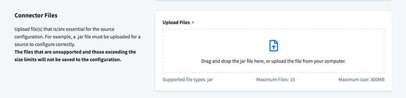
To Upload the Files
This is a mandatory section for the custom connector.
Add the BaseConfig element after the Form element to upload a custom connector jar file for the connector.
For example:
<BaseConfig>
    <Field name="fileUpload" maxFiles="6" supportedExtensions="json,jar,xml,zip,png" type="fileupload" maxSize="1" validateJSON="false"/>
</BaseConfig>
Definition of attributes in the BaseConfig element:
-
name – The name of the file upload button.
-
maxFiles – The maximum number of files that can be uploaded.
-
supportedExtensions – The file extensions which are allowed to be uploaded.
-
type – The type of file component.
-
maxSize – The maximum file size allowed in MB.
-
validateJSON – If set to
true, then the JSON file will be validated when it is uploaded.
The following screenshot is the how the example is represented in the UI:
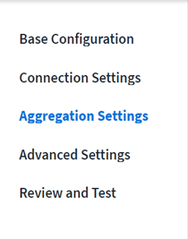
The Menu Element
Each Menu item refers to an independent and navigable page containing different parameters of configuration. Different parameters are defined using the Section element(s). All the Menu elements together define the entire source configuration UI.
Note
A Menu element must be placed under the root element only i.e. the Form element. You can include one or more Menu elements per your requirements.
You need to provide all the Menu list items through the source-config, except for the Base Configuration and Review and Test items.
Base Configuration parameters are common across all the connectors and are generated dynamically by the new framework and hence need not be provided through the source-config.
The Review and Test Menu item aggregates and displays information from all the other Menu items, to review before testing the connection to the native system. This item is generated by the new framework dynamically, depending upon the configured source. Therefore, this also does need not to be provided through the source-config.
For example:
<Form>
<Menu name="ConnectionSettings" label="Connection_Settings">
.
.
</Menu>
<Menu name="AggregationSettings" label="Aggregation_Settings">
.
.
</Menu>
<Menu name="AdvancedSettings" label="Advanced_Settings">
.
.
</Menu>

</Form>
Definition of attributes in the Menu element:
-
name – The name of a Menu item or a key for a corresponding localized message. The value of this attribute can also be used to form the URL that gets displayed in the browser’s address bar when this Menu item is selected.
-
label – The label of a Menu item or a key for a corresponding localized message that should be displayed on the UI.
The following screenshot is the how the example is represented in the UI:
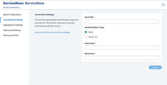
The Section Element
A Section is used to group a set of related form Field(s) such as textbox, drop-down list, etc. A section can include one or more Field elements.
For example:
<Section name="authtype" label="Connection_Settings" sectionInfo="Write about connector in few lines to appear as section information"
    <Field name="username" displayName="Username" type="text" required="true" parentKey="authtype" parentValue="Basic" />
    <Field name="password" displayName="Password" type="secret" required="true" parentKey="authtype" parentValue="Basic" />
</Section>
Definition of attributes in the Section element:
-
name – The Section(s) name or a key for a corresponding localized message of the Section.
-
label – The Section(s) label or a key for a corresponding localized message that should be displayed on the UI.
-
sectionInfo – The summary of the connector on the source list page.
The following screenshot is the how the example is represented in the UI:
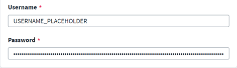
The Field Element
Fields represent different types of UI components depending on the attribute type value. There can be one or more Field elements within a Section.
For example:
<Field name="username" placeHolder="USERNAME_PLACEHOLDER" type="text" required="true"/>
<Field name="password" displayName="Password" type="secret" required="true"/>
Definition of attributes in the Field element:
-
name – The name of the field or a key for the corresponding localized message.
-
displayName – The label of the field or a key for the corresponding localized message that should be displayed on the UI.
-
placeHolder – The additional placeholder information for the text field.
The following screenshot is the how the example is represented in the UI:
Using Attributes to Customize the Field Element
These attributes can be used to customize the Field element, as required by the connector.
name
The name attribute is used to reference the element in the form data after the form is submitted. The value of the name must be the same as that of the source/connector’s configuration name.
Important
If it is not added correctly, the source functionality may break.
For example:
<Field name="user" displayName="Service Account" type="text" required="true"/>displayName
The displayName refers to the name of the fields in the form section.
For example:
<Field name="url" displayName="SalesforceURL" type="text" required="true"/>helpkey
The helpkey attribute refers to the help message for any complex field. If it is provided, then placeholder text is not needed, and vice versa.
For example:
<Field name="user" displayName="Service Account" type="text" helpKey="userHelpKey" required="true"/>placeholder
The placeholder attribute refers to the placeholder information for the text field. This information vanishes as soon as the user enters something into the field.
For example:
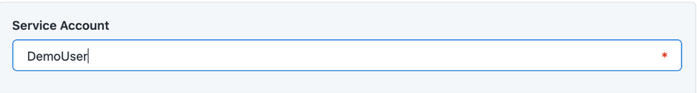
<Field name="user" displayName="Service Account" type="text" placeHolder="enter some placeholder value" required="true"/> Using Type Attributes for Various Field Requirements
type=”text”
Represents a text box to read the string inputs.
For example:
<Field name="user" displayName="Service Account" type="text" required="true"/>The following screenshot is the how the example is represented in the UI:
Note
The default max length for the text/URL/email field is 256 characters. If the input is more than 256 characters, be sure to specify the maxlength explicitly.
For example:
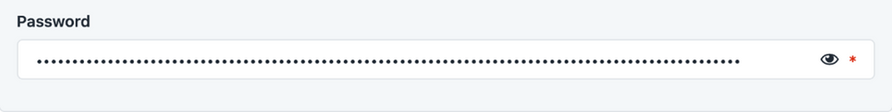
<Field name="TestField5" displayName="TestField5" type="text" required="true" maxlength="999" />type=”secret”
Represents a text box to read secret string inputs like passwords, access keys, etc.
For example:
<Field name="password" displayName="Password" type="secret" required="true"/>The following screenshot is the how the example is represented in the UI:
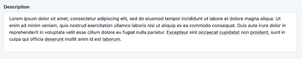
type=”textarea”
Represents an input field for reading long string inputs like descriptions, personalized feedback, etc.
For example:
<Field name="description" displayName="Description" type="textarea"/>The following screenshot is the how the example is represented in the UI:
type=”number”
Represents a text box to read number inputs. The min and max attributes indicate the minimum and maximum values that can be entered. The step attribute indicates the factor by which we can increment/decrement the value using the “up/down” arrow buttons. For example, step=”2” will allow us to increment/decrement the number by 2 (i.e. 2, 4, 6...) when the min value is set as 0.
For example:
<Field name="connectionTimeout" displayName="Connection_Timeout" type="number" min="0" max="1000" step="1"/>The following screenshot is the how the example is represented in the UI:

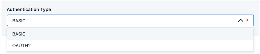
type=”select”
Represents a drop-down list for selecting a single value.
For example:
<Field name="authtype" type="select" required="true" defaultValue="Basic">
    <AllowedValues>
        <Option value="Basic" label="BASIC"/>
        <Option value="OAuth2" label="OAUTH2"/>
    </AllowedValues>
</Field>
Note
The options for a select field are configured as a static list. For example, if a user configures field1 of Menu 1 to save a list/array of cities. A select field named field2 on Menu 2 depends on the saved data of field1 from Menu 1 to populate its options.
The following screenshot is the how the example is represented in the UI:
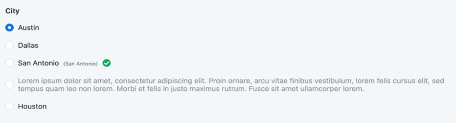
type=”radio”
Represents a radio button for choosing one option from a given set of options.
For example:
<Field name="city" type="radio" defaultValue="austin">
    <AllowedValues>
        <Option value="austin" label="Austin"/>
        <Option value="dallas" label="Dallas"/>
        <Option value="sanAntonio" label="San Antonio"/>
        <Option value="loremDesc" label="Lorem ipsum .."/>
        <Option value="houston" label="Houston"/>
    </AllowedValues>
</Field>
Note
The options for a radio field are configured as a static list.
The following screenshot is the how the example is represented in the UI:
type=”typeahead”
Represents a type ahead field for choosing one option from a given set of options. The type ahead field type should be used when there are a lot of options and you want to make it easy for the end-users to search for the desired option from the list.
For example:
<Field name="va_cluster" type="typeahead" defaultValue="va-1">
    <AllowedValues>
        <Option value="sandeep-va" label="Sandeep-va"/>
        <Option value="sandeep-local" label="Sandeep-local"/>
        <Option value="loremDesc" label="Lorem ipsum .."/>
        ..        ..        ..
    </AllowedValues>
</Field>
The following screenshot is the how the example is represented in the UI:
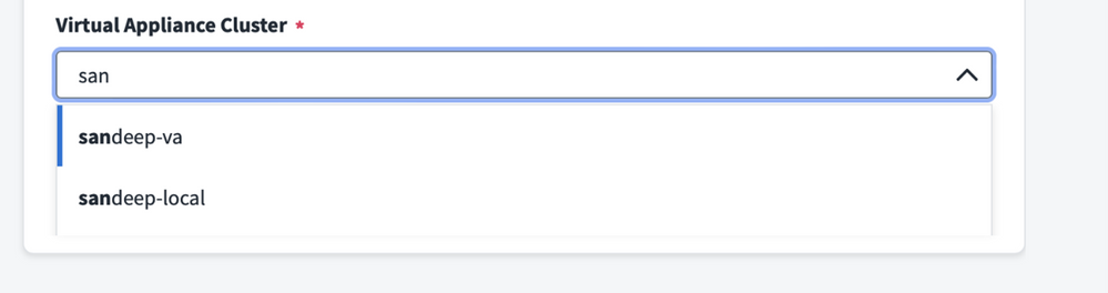
Note
The options for a typeahead field are configured as a static list.
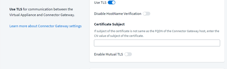
type=”toggle”
Represents a button for selecting a Boolean value.
Note
The toggle field type should be used when it has other dependent fields to show/hide.
For example:
<Field name="TlsEnabled" displayName="Use TLS" type="toggle" defaultValue="true"/>The following screenshot is the how the example is represented in the UI:
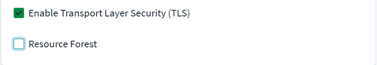
type=”checkbox”
Represents a field type for selecting a Boolean value.
Note
This type should be used only for independent fields.
<Field name="TLSEnabled" displayName="Enable Transport Layer Security (TLS)" type="checkbox" defaultValue="false"/>The following screenshot is the how the example is represented in the UI:
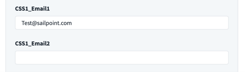
type=”email”
Represents a field type for email details in XML format.
For example:
<Field name="CSS1_Email1" displayName="CSS1_Email1" type="email" defaultValue="Test@sailpoint.com" />
<Field name="CSS1_Email2" displayName="CSS1_Email2" type="email" />
The following screenshot is the how the example is represented in the UI:
Note
The default max length for text/URL/email field is 256 characters. If more than 256 characters are required, be sure to specific a maxlength explicitly.
For example:
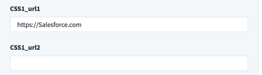
<Field name="TestField5" displayName="TestField5" type="text" required="true" maxlength="999" />type=”url”
Represents a field type for URL details in XML format.
For example:
<Field name="CSS1_url1" displayName="CSS1_url1" type="url" minlength="7" defaultValue="https://Salesforce.com" />
<Field name="CSS1_url2" displayName="CSS1_url2" type="url" minlength="7" />
The following screenshot is the how the example is represented in the UI:
Note
The default max length for text/URL/email field is 256 characters. If more than 256 characters are required, be sure to specify a maxlength explicitly.
For example:
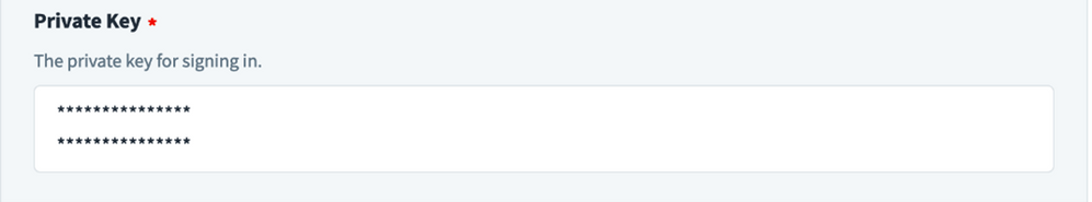
<Field name="TestField5" displayName="TestField5" type="text" required="true" maxlength="999" />type=”secrettextarea”
Represents the field type for secret text area details in XML format.
For example:
<Field name="private_key" displayName="Private Key" type="secrettextarea" required="true" helpKey="helpKey_private_key" parentKey="grant_type" parentValue="Jwt"/>The following screenshot is the how the example is represented in the UI:
type=”list”
Represents the field type for list details in XML format.
For example:
<Field name="TestList" displayName="Retry Error List" type="list" required="true" />The following screenshot is the how the example is represented in the UI:
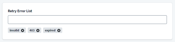
The source XML representation for the list component in the example above is:
<entry key="TestList">
    <value>
        <List>
            <String>invalid</String>
            <String>403</String>
            <String>expired</String>
        </List>
    </value>
</entry>
placeHolder String Guidelines
To escape quotes (") in placeholder string, you can use "
For example, if the string is, "For example, filter for removing users with condition: deleted == "true" "
You can write it as follows in XML:
placeHolder="For example, filter for removing users with the condition: deleted == "true" "“parentKey” & “parentValue” Attribute Guidelines
The parentKey and parentValue attributes are used to specify a parent-child relationship between the two XML elements, where the element specifying them is considered the child. Use these as a Field element where parentKey specifies the name of the parent element and parentValue specifies the parent element’s value.
For example, suppose you want a Section (child) labeled “Connection Credentials” to be displayed on the UI only if another Field (parent) named authtype is set to Basic. Here is an example for this scenario:
<Section ...>
            <!-- Parent Element -->
            <Field name="authtype" type="select" required="true" defaultValue="Basic">
                <AllowedValues>
                    <Option value="Basic" label="BASIC"/>
                    <Option value="OAuth2" label="OAUTH2"/>
                </AllowedValues>
            </Field>
        </Section>

        ...
        ...
        <!-- Child Element -->
        <Section name="CONNECTION_CREDS" label="Connection Credentials" parentKey="authtype" parentValue="Basic">
            <Field name="username" type="text" required="true"/>
            <Field name="password" type="secret" required="true"/>
        </Section>
Note that the child element has parentKey=”authtype” where authtype is the name of the parent element and parentValue=”Basic” where Basic is the parent element’s value.
The parentKey, parentValue attributes can be used with any type like select, toggle, radio, etc. to hide/show other Field and Section elements.